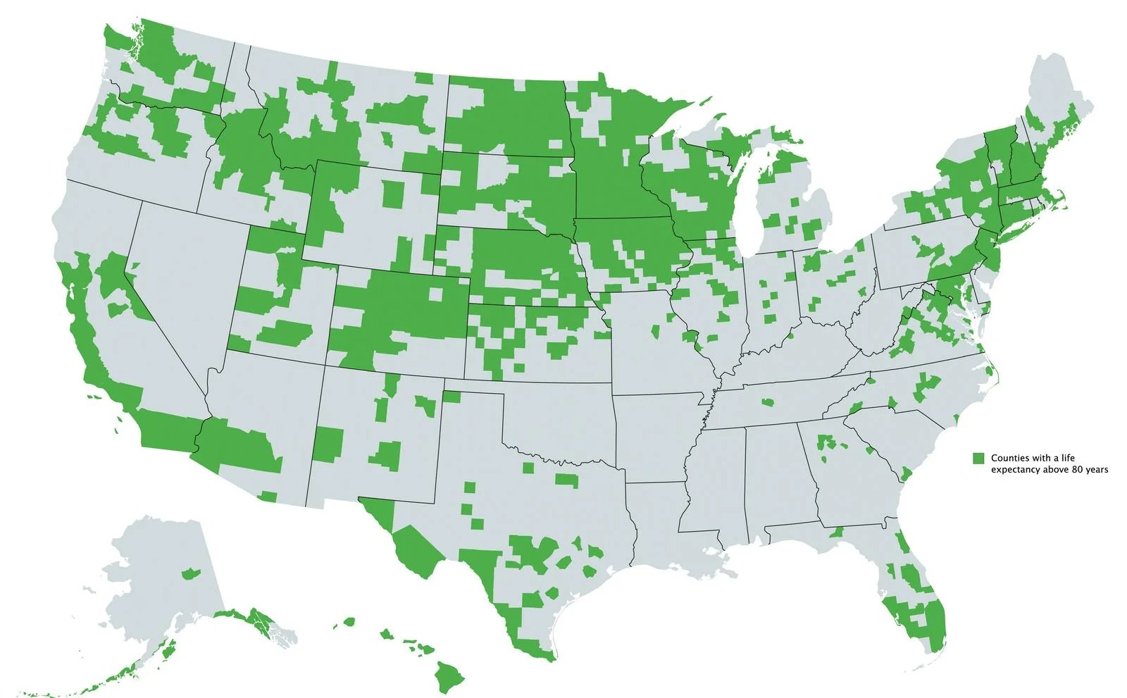
What’s weird is seeing this include Austin(Travis county - part of that blob in the middle of Texas), but San Antonio, Houston and Dallas are missing. It looks like the counties north and south of Harris(Houston) make the cut, but not Harris county itself. All of those cities are big liberal cities in Texas.
Harris County’s air and water are notoriously polluted with carcinogens from the nearby fossil fuel and plastics plants. There’s a reason the U.S.'s most advanced cancer research center is in Houston.
Similarly, affluent white suburbs of Atlanta are included, but Fulton County itself (where most of the actual city is) and the poor black suburb of Clayton County are missing. I wonder what the difference could be?

Basically nowhere in the south except parts of Florida and Texas huh
people that made it past retirement age moving to South Florida could skew the data curve
Phoenix, too.
I saw an explanation that this is effectively mapping White and Latino populations.
Which also led me to learn about the Hispanic Health Paradox, which was a very interesting read.
And liberal big cities, like Atlanta.
What’s weird is seeing this include Austin(Travis county - part of that blob in the middle of Texas), but San Antonio, Houston and Dallas are missing. It looks like the counties north and south of Harris(Houston) make the cut, but not Harris county itself. All of those cities are big liberal cities in Texas.
Harris County’s air and water are notoriously polluted with carcinogens from the nearby fossil fuel and plastics plants. There’s a reason the U.S.'s most advanced cancer research center is in Houston.
Similarly, affluent white suburbs of Atlanta are included, but Fulton County itself (where most of the actual city is) and the poor black suburb of Clayton County are missing. I wonder what the difference could be?
Miami: Heaven’s Waiting Room